 Pre built UI
How to use
- You will need to modify the
ThirdParty.init(...)function call. - Component overrides can be configured at
override.componentsconfig object. - Pick a component that you'd like to override by its key.
- Supply a React component against the key you have picked. Your custom component will get the original component as a
prop.
Example#
- ReactJS
- Angular
- Vue
- Plain JavaScript
- React Native
Note
You can use the
You can refer to this example app as a reference for using the
supertokens-web-js SDK which exposes several helper functions that query the APIs exposed by the SuperTokens backend SDK.You can refer to this example app as a reference for using the
supertokens-web-js SDK.Note
To use SuperTokens with React Native you need to use the
To add login functionality, you need to build your own UI and call the APIs exposed by the backend SDKs. You can find the API spec here
supertokens-react-native SDK. The SDK provides session management features.To add login functionality, you need to build your own UI and call the APIs exposed by the backend SDKs. You can find the API spec here
What type of UI are you using?
Prebuilt UICustom UI
What type of UI are you using?
Prebuilt UICustom UI
import React from 'react';
import { SuperTokensWrapper } from "supertokens-auth-react";
import { ThirdpartyComponentsOverrideProvider } from "supertokens-auth-react/recipe/thirdparty";

import octocat from "./octocat.png";

function App() {
    return (
        <SuperTokensWrapper>
            <ThirdpartyComponentsOverrideProvider
                components={{
                    // In this case, the <ThirdPartySignUpFooter_Override>
                    // will render the original component
                    // wrapped in a div with an octocat picture above it.
                    ThirdPartySignUpFooter_Override: ({ DefaultComponent, ...props }) => {
                        return (
                            <div>
                                <img src="octocat.jpg" />
                                <DefaultComponent {...props} />
                            </div>
                        );
                    },
                }}>
                {/* Rest of the JSX */}
            </ThirdpartyComponentsOverrideProvider>
        </SuperTokensWrapper>
    );
}
export default App;

important
Please make sure that the file in which this config is specified is a .tsx or .jsx file type.
Finding which component will be overridden#
To do that, you should use React Developer Tools extension which provides a component tree inspector.
Example#
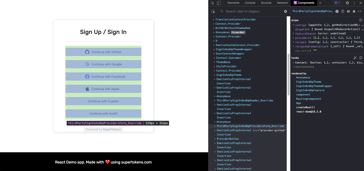
- Look for the names defined in component override config and/or components ending in
_Overridein the component tree. - Ensure that's the component you want to override
- Provide an override function
How do I render the original component#
Because the override function receives the original component as a parameter, you can render it. To do this, simply use it in JSX. Don't forget to supply original props by spreading them.
import React from "react";

const customComponent = ({ DefaultComponent, ...props }: { DefaultComponent: React.ComponentType }) => {
    return (
        <>
            <h1>I'm a header that you added above original component</h1>
            <DefaultComponent {...props} />
        </>
    )
}